Abstract
There’s a fairly ‘old’ post from 2012, Design Tip: Never Use Black by Ian Storm Taylor, that seems to have a longstanding foothold in today’s visual design—namely with the developers who are looking for advice since they’ve not much training in the topic.
This post rightfully points out that in the real world shadows, dark regions are rarely #000000 black.
However admist what could be height of ‘dark theme’ usage, I want to shed light on the whens & whys one would choose to use black as well as an alternative that works towards your users.
Beliefworthy?
Like Taylor’s anecdote about Mrs. Zamula, I too have had a number of teachers. While I suppose my calling ended up with me making software, there was a time where software was just a tool for art (or math class). I got a Bachelor of Science in Art riding a scholarship of fine arts from my high school years (where I was voted by classmates with the superlative of “most artistic”). And I remember in high school learning to use the complimentary color to the light to make a shadow more ‘authentic’ or ‘real’. I’ve also been a life-long user of technology & could use a lot less screen time if we are being honest 😅.
Does this make my opinion more authoritative? Heck no, but I have done my studies instead of just another rando on the internet.

True black isn’t natural
In an unscientific study of a few minutes sitting in a shaded alley at a café, I took some (unfiltered) afternoon photos with an okay 2019 smart phone.
Ignoring how imperfect the exposure truly was (they looked close enough to what my eyes were seeing), I used the eyedropper of an image editor app to extract the darkest regions in a photo.
In these photos, I couldn’t grab anything lower than about #111111 (the shadow under a parked car). I was able to reproduce Taylor’s result, in daylight. Nature.
But here a photo of my laptop with an OLED panel on the true black Linux tty.
OLED displays are known for their blackness as the individual pixels can be turned completely off prompting all tech reviewers label it “inky blacks”.
So what color do we get for this black?
Something in the ballpark the #161616 range.
The exposures on these shots are bound to account for the difference (with color balance omitted), but to me this indicates that the ‘unnatural’ black of a black display is within range of nature.
If my panel was an in-plane switching kind—or IPS—that we see in lower-end devices, the the display would even be producing light to make “black” even less black.
Our UIs manifest themselves inside objects part of the physical world around them & we will percieve the colors based on the context of their surroundings.
Even in the case of something like a virtual reality (VR) headset, we are looking to exist in the same blackness as your bedroom at night with the doors shut or when one closes their eyes.
The ‘true’ blackness of this room exists in as much as it should in VR as well as my laptop or my phone (AMOLED).
When you publish something in #000000, it’s already not black because of the setting.


Are UIs natural?
user interface noun
: software that is designed to allow a computer user to interact with the operating system of a machine or system (such as by selecting presented options or entering text commands)
As much as computers have taken over many our lives, they ultimately are a part of a virtual setting; user interfaces (UI) are for computers.
Are computers & their UI environments a part of nature? Nope. They are a system built atop the virtual. Let me show you a simulation of a ‘real world’: The Elder Scrolls V: Skyrim.
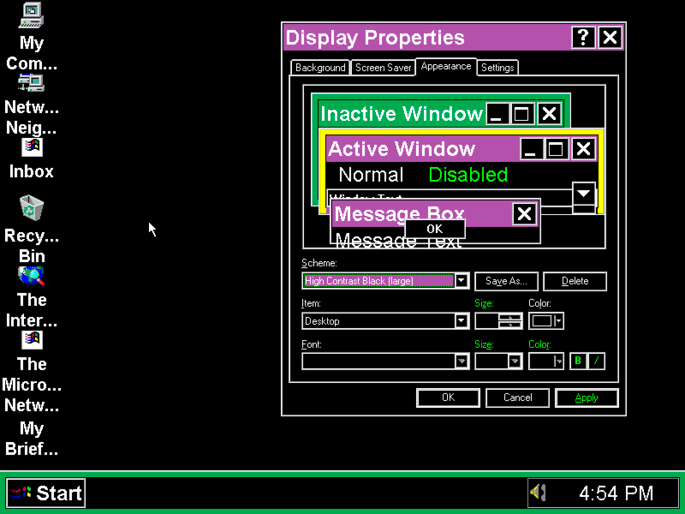
When Skyrim was released (the first time) back in 2011 it was praised not just for the gameplay & glitches but also for inovating in UI design—especially for fanasy games.
That UI with Celtic knot accents has a transparency effect, but it is #000000. The main menu screen screen: true black.
True black also shows up in The Legend of Zelda: Breath of the Wild, Shovel Knight, pause menu in Celeste, & the list goes on.
These teams also have big budgets to mull over layouts + color be an optimal experience for users yet still ended up choosing our trusty black.
Are these video game UIs unnatural? Does the question even make sense for UIs to be “natural”? I would argue it doesn’t as they are virtual spaces or meant to overlay the natural—be that just the menus or even the content.
Dubious ethical tangents?
In the approriately-titled No, “AMOLED Black” Does NOT Save More Battery Than Dark Gray, Google™ Material Design 2’s suggested #121212 uses 0.3% the power of #ffffff white pointing out users like me will say “0.3% is still higher than 0%!”. Using dark mode is going to save you battery on an OLED device, it might also be ever so much better for the planet consuming less power.
The myth here is that gray means the pixels aren’t totally off consuming a lot of additional power which is false.
But I like to go to the Xtreme, & while 0.3% won’t change much for oneself, at human population scale with multiple screens as well as various always-on kiosk displays scattered around, it could have some effect.
Google™ also mentioned in that post that somehow text is easier to read since there’s less contrast. However, this seems silly to me since you can reduce the text color just a bit more for the same contrast. But speaking of contrast…
It seems if we are aiming for maximum contrast for the visually impaired, straight up black on white isn’t a bad call. When you need that sort of contrast, do not feel afraid to reach for it.
OLED users are users too
OLED technology has taken off since the smart phone. My first smart phone was Samsung Galaxy S II, like the original comes with a 4" Super AMOLED display. There was a time where Android apps loved to make sure there was an AMOLED-compatible display—which now seems to be relegated to the space of FOSS applications on F-Droid. But the tech hasn’t died. We are now onto new tech like QD-OLED—which is the sort of curved monitor I picked up. Blacks look good on OLED displays, & not just that but as mentioned it saves a bit more power and will delay any possible screen burn-in issues. These displays aren’t getting less popular.
On the subjective side, I find of all the panels I’ve owned, standard OLED, AMOLED, QD-OLED, that added color tints to be more ‘natural’ or ‘branded’ looks drastically worse on top of washed out feeling of very-dark-but-not-black grays in many UIs. I know branding teams wants to tint everything in a direction, but that’s not going to be the best experience in a lot of cases. I’d prefer designs stuck to neutral grays instead of shifting warm, cool, purple, or whatever (but Material Design 3 is embracing this off-color-ness & have found Android apps feel less cohesive as a result).
But it’s too much contrast
I have a theory.
My theory is that a lot of these low contrast themes such as Zenburn were created at a time when users on older liquid-crystal display (LCD) panels in the harsh, fluorescent canopy of office spaces at the time.
To compete with the the light, monitors must blast even more photons to compete.
The practice of keeping one’s monitor bright is a holdover from bright environments or laziness/cumbersome brightness adjustment on external displays (a problem laptops & phones don’t have anymore).
My external monitor, like many modern kinds, has a joystick that makes quick work of adjusting brightness & I adjust accordingly.
One way to lower one’s contrast is to lower the display panel’s brightness which can also saves more power.
The more contrast a UI has, the easier it is to use in lower brightness scenarios.
When you build a low-contrast UI you are necessarily demanding more brightness from your users to compensate.
…And if you really do prefer bright+low-contrast & want that experience for your users who also prefer it, you can use CSS Media Queries Level 5’s prefers-contrast: low.
As an additional anecodete, I had a coworker mention he had a strong preference towards to low-contrast. When I prodded for more info, I got a not-so-surprising answer that his used monitor was always at full-tilt brightness since the brightness adjustment was janky/broken & to handle the extremes of seeing the monitor in broad daylight, the setting was left at max. This is also an edge case which is just one demonstration that an otherwise-abled man rathered a low-contrast theme as an outcome of improper lighting.
That said, most users won’t appreciate high contrast as a default.
Taylor’s post does rightfully point out that when using pure white as a background, if you want a dark-accented navigation such as a side panel, yeah, you might not want be pairing #000000 with #ffffff—but even that can have a place. At 2% brightness in broad daylight, this contrast will help (light-level media query was removed).

I don’t really care; I just want my website to be legible
While I can’t comment much on the technicalities of building natively (though there are OS theme defaults), if building a website, you as a designer have the option to care less. By “care less” we mean letting the user agent define our base colors. To do this:
:root {
	color-scheme: light dark;
}
This will allow the user agent to control the <system-color> values such as Canvas, CanvasText, LinkText.
What’s neat about these values are that user agents can adjust theme based on the color scheme meaning a ‘dark’ theme will use a dark value for the Canvas & a light color for CanvasText, but also can tailor a LinkText ‘default blue’ to me legible on that dark background—i.e. no #0000ff on #000000 which is hard to read.
But it doesn’t end here! No, users can override these values to suit themselves:
You may need to toggle some GTK-related features if it’s not setting values. resistFingerprinting = false might be needed for dark theme as well (which unfortunately has privacy & compatibility side-effects).
Recommend me a #000 GTK theme as I’ve yet to find a complete one.
Here I have set browser.display.background_color.dark to #000000 to suit my needs/preferences with on OLED panels (works on Android too!).
You can also make light backgrounds #ffff00 yellow if you wanted to.
What matters is that the user can define their settings in the user agent & hopefully some sites, especially the text-heavy, can respect that.
If you are in the don’t-really-care category, letting the users/user agents decide is 100% for you & better than what default Bootstrap is giving you.
On white
The same argument applies to #ffffff but in the inverse; it can often be preferable to off-white.
As an owner of an e-reader too, when your off-white drifted far enough to be considered a shade of gray, you’ve made it harder to read.
Takeaway
Bottom line is: when you find
#000000in your color picker, ask yourself if you really want pure black. You’re probably better off with something more natural.
Disagree at “probably”.
If you’re making a painting or a rendering to mimic the ‘real’ world, this is pretty good advice. This would also apply to some design systems that demands shadows for depth mimicking the nature’s shadows for depth. However, often when building UIs / websites, there are outside factors you should consider before writing off our pal #000000
- Does ‘natural’ even make sense for my design?
- Will my design have appropriate contrast in low-visibility & other settings?
- Will my design look good on various types of displays?
-
Is my audience the kind that prefers/appreciates
#000?
Many of these question may leave you with #000000 as an appropriate answer & you shouldn’t feel ashamed for choosing it.
As much users shouldn’t feel weird for preferring it. Whether inspired by your favorite game, the darkness of a metal track, or the void of outer space, as a designer (or ‘designer’), you can always consider a light | dark | black | white color scheme as well.
In this dark/black & light/white scenario, not much needs to change besides the canvas
…Or think about not picking at all & letting the user agent suggest colors for you.